如何使用css实现图片宽高自适应
更新于 阅读 41 次

本文主要是结合自己在学习中使用css来实现图片的宽高自适应,并给出相应的结局方案。
场景
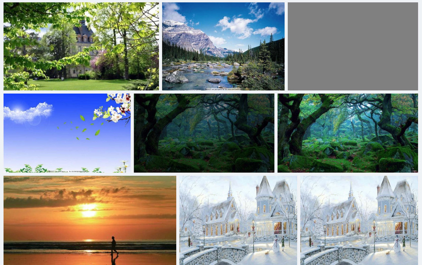
给定一系列图片,图片宽高不等,每行所展示的图片数量不等,如何实现图片的自适应。
实现方法
聪明的你肯定会想到使用flex布局,并且设置flex-wrap: wrap。但如何做到自适应宽度呢:
我们假设图片原始宽度、高度分别为width、height,首先如果没有设置任何样式,那么图片高度肯定是不一样。于是设置一个参考高度200px,这样宽度就会有剩余,那么剩下的宽度如何撑满呢,使用flex-grow: width * 200 / height分别放大对应的图片(图片的放大倍数其实每张图片的宽度)。
下面看一张实现后的效果:
代码(React)
// list.jsx
class List extends React.Component {
  render() {
    return (
      <div className={style.list}>
        {
          this.props.images.map((img, index) => <Item key={img.id} image={img}/>)
        }
      </div>
    )
  }
}

// item.jsx
// 图片的参考高度设置为200px,
class Item extends React.Component {
    // xxxxxx
  render() {
    const {
      attributes: { url, width, height },
    } = this.props.image;

    return (
      <div
        className={style.imageContainer}
        style={{
          width: `${(width * 200) / height}px`,
          flexGrow: (width * 200) / height,
        }}>
        <img
          src={url}
        />
        <div
          className="placeholder"
          style={{
            paddingBottom: `${(height / width) * 100}%`,
            display: loaded ? 'none' : 'block',
          }}
        />
      </div>
    );
  }
}
样式(scss)
.list {
  display: flex;
  flex-wrap: wrap;
  &::after {
    content: '';
    flex-grow: 9999999;
  }
}

.imageContainer {
  display: inline-block;
  margin: 4px;
}
PS
上面解决了图片自适应问题,但是如果最后一行只有一张图片(或图片数量很少),最后一行的图片可能会很高,这时就可以找一个元素把剩余的空间撑起来,这样就相当于不让最后一张图片缩放或缩放的比例很小(高度维持在200px左右),使用伪元素after,并设置一个很大的flex-grow值。
标签: